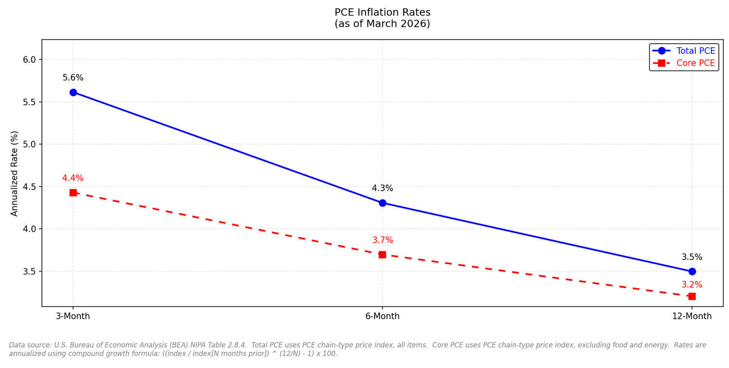
March 2026 PCE through different windows.
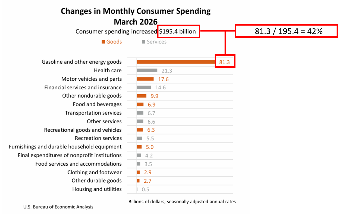
Chart 1: Gasoline accounted for 42% of March's spending increase. (81.3 ÷ 195.4 = 0.416 --> 42%)
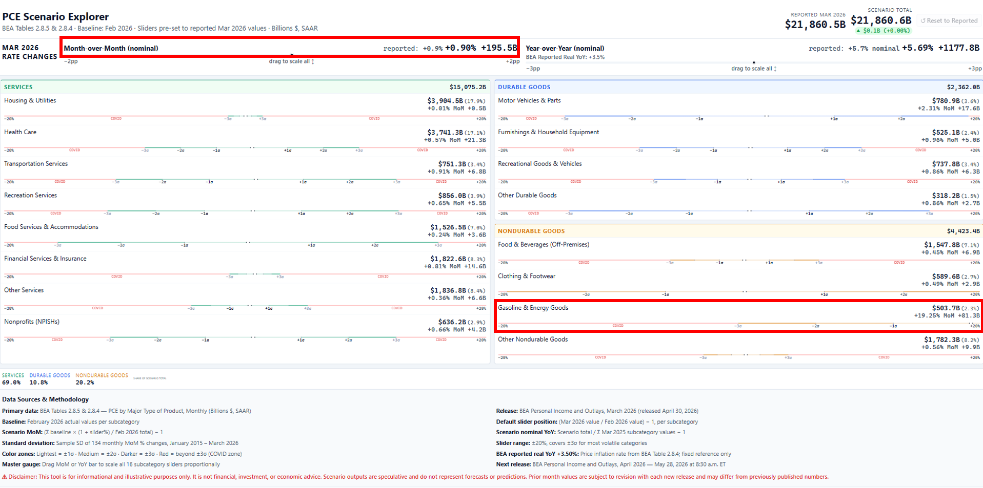
Chart 2: Gasoline is about 2.3% of total PCE
Chart 3: 3-month, 6-month and 12-month price change, annualized.


PCE Scenario Explorer. Don't let the red deceive you as it actually shows you how stable housing, utilities, financial services and insurance can be.
Slide anything you want to see how PCE is affected. Meant to help show how big month-to-month swings can be for each category.
NOTE: prior month values are subject to revision with each new release and may differ from previously published numbers.
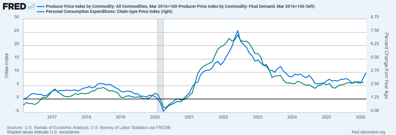
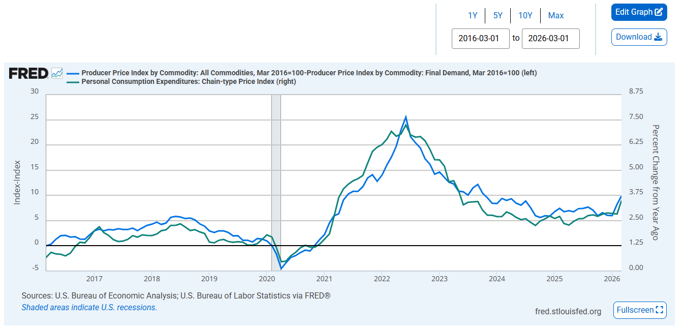
A chart of PCE inflation versus the gap between All Commodities PPI and Final Demand PPI shows they tend to rise and fall together, reflecting shared inflationary pressure across producers and consumers over time.
Blue line = gap between All Commodities PPI and Final Demand PPI (indexed to Mar 2016 = 100).
Green line = actual PCE inflation (% change from year ago).
*Rough proxy, NSA data, not a formal forecast.

